UI/UX audit for an e-commerce website
Detailed analysis of the homepage, product pages and checkout flow with clear suggestions for improvement.
Initial situation & goal
The shop already had traffic, but lacked trust and a clear user flow: noisy layout, weak product presentation and no obvious path to purchase. The goal was to produce concrete, actionable recommendations the client could implement step by step.
Approach
Structured heuristics
- Analysed homepage, listings and product pages for clarity, focus and readability.
- Reviewed navigation, header structure and use of banners.
- Checked CTA placement, contrast and visual hierarchy of elements.
User flow & conversion
- Walked through the entire purchase journey (from landing to checkout).
- Identified drop-off points (distractions, uncertainties, missing information).
- Suggested ways to reduce cognitive load and simplify form steps.
Documentation & prioritization
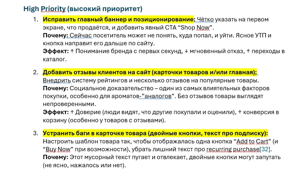
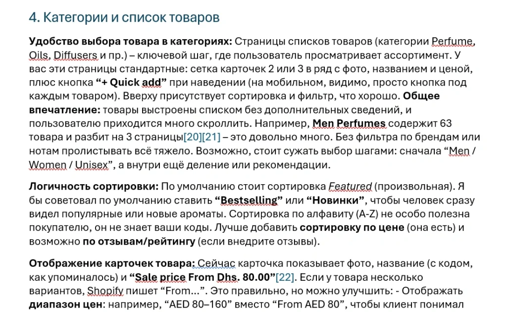
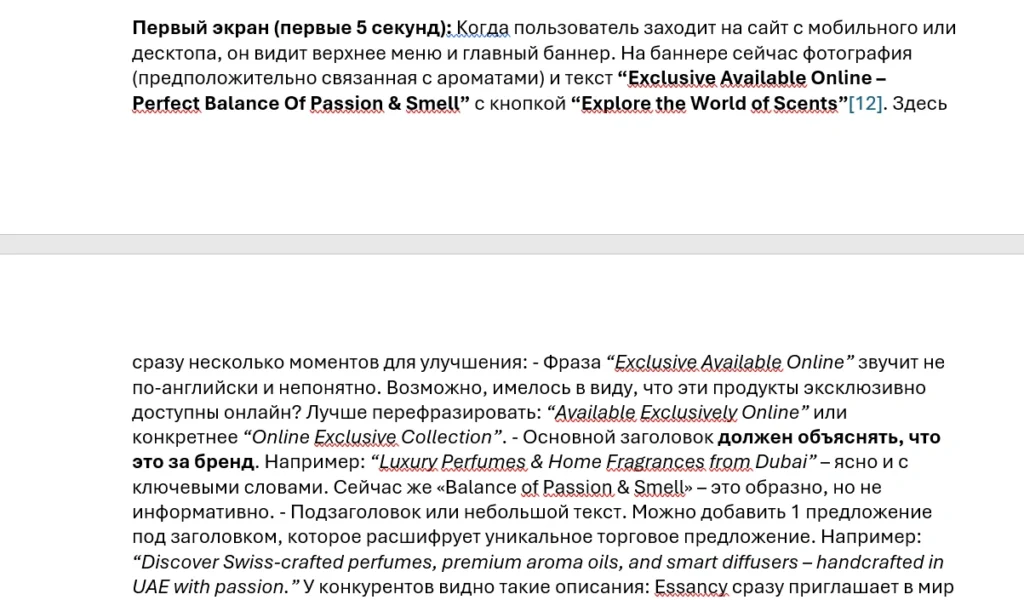
- Created a specific issue list with screenshots and short comments.
- Prioritized items as “must have”, “should have” and “nice to have”.
- Gave recommendations on what to change immediately and what to plan later.
Developer-friendly perspective
The audit was created not only from a design angle, but with realistic implementation in mind (theme structure, CSS adjustments, platform limitations). This makes the recommendations practical and feasible.
Key findings & recommendations
Homepage
- Reduced the number of equally strong blocks in the first screen, clearer focus on the main CTA.
- Unified typography and spacing for a calmer, more trustworthy look.
- Suggested adding a clear “Why this shop?” section above the fold.
Product pages
- Improved prioritization of product title, price, CTA and key benefits in the visible area.
- Clearer presentation of variants, quantity and delivery information.
- Recommendations on where and how to use social proof (reviews, trust badges).
Checkout & form logic
- Simplified forms and grouped fields more logically.
- Highlighted the next steps in the order process more clearly.
- Reduced distractions and secondary links during checkout.
Result for the client
The client received a structured document with concrete suggestions, examples and priorities. Some changes were implemented quickly, the rest went into planning for a broader redesign.
Example reports to download
In addition to screenshots, you can review two full example reports. They show how I structure UX/UI audits, prioritise issues and turn them into clear, actionable recommendations for business owners.
UX/UI audit of a fragrance online store (Somonion Aroma, RU)
A complete UX/UI audit of a niche Shopify store: home page, category pages, product pages and checkout, plus a prioritised list of improvements (High/Medium/Low) with concrete design, structure and conversion suggestions. The report is written in Russian and illustrates how I work with e-commerce projects.
Market analysis & website optimisation for MurtalTaxi (DE)
Detailed German-language report: market and competitor analysis of Austrian taxi companies, comparison of their websites, a UI/UX audit of murtal-taxi.at, SEO recommendations and a prioritised action list (A/B/C measures) for a website relaunch and stronger online visibility.


